Understanding Your Loyalty Tiers Performance Dashboard
- DarkLight
Understanding Your Loyalty Tiers Performance Dashboard
- DarkLight
Article summary
Did you find this summary helpful?
Thank you for your feedback
Is this article for me?
If you joined Yotpo Loyalty & Referrals before August 11, 2025, please visit this VIP Tiers Dashboard guide.
Dashboard Overview
The Loyalty Tiers Performance Dashboard offers a clear and actionable view of how your Loyalty Tiers program is performing. With intuitive filters and dynamic charts, you can evaluate trends, understand customer behavior across loyalty tiers, and identify opportunities to optimize your program.
Whether you're reporting on results or looking for ways to grow customer loyalty, the Loyalty Tiers Performance Dashboard gives you the insights that matter.
Why use it?
Evaluate the health and performance of your loyalty tiers.
Filter and compare data over time to track progress.
Segment data by order source.
Visualize tier movements and customer behaviors.
In this article, you’ll learn how to use and read the data in the Loyalty Tiers Dashboard.
Getting Started
To access the dashboard, go to Analytics > Loyalty Tiers Performance and use the filters to customize your view.
Note
Data refreshes daily around 6:00 a.m. EST.
Revenue values are displayed in your store’s base currency. Orders made in other currencies are converted before appearing in the dashboard.
Understanding the Metrics
Dashboard Filters
At the top of the dashboard, you can filter your data based on timeframe and order type:
Date picker: Choose between the last 12 months, last 6 months, last quarter, or a custom period.
Order types: Choose between all orders, online orders only, or Shopify POS orders only.
Important
The dashboard only displays data for Shopify POS orders. Other POS integrations are not reflected in the data.
The POS filter will always be displayed as an option, regardless of whether you use Shopify POS or not.
Key Metrics
This section provides a snapshot of your VIP program’s performance based on the selected filters.
Revenue
Total Loyalty Tiers revenue: Total revenue generated from customers who were assigned to any Loyalty tier, except the base tier, during the selected period.
Loyalty Tiers revenue share: Percentage of revenue that was generated by Loyalty tiers.
Total store revenue: Total store revenue generated by all customers during the selected period.
If your program includes a base tier and you’re using Shopify’s new Customer Accounts with the All Customers opt-in strategy, all customers automatically become loyalty members. In this case, the Total Loyalty Tiers revenue and Total store revenue will have equal values.
Tier upgrades
Loyalty Tiers upgrades: Percentage of customers in a tier who moved up during the period. For example, if 45 customers upgraded from Silver out of 375 total, the rate is 12%.
Customers upgraded: The number of customers upgraded to a higher tier at least once during the selected time period. We count only unique customers.
Tier downgrades
Loyalty Tiers downgrades: The number of customers who moved to a lower Loyalty tier during the same time window. If a customer upgraded multiple times, only the highest tier reached is counted.
Customers downgraded: The number of customers who have been downgraded at least once during the selected time period. Only unique customers are counted.
How are tier upgrades and downgrades calculated?
We compare the customer’s tier at the start of the selected period to their tier at the end. Only the final movement is counted. For example, if a customer upgraded and later downgraded within the selected period, only the downgrade is reflected.
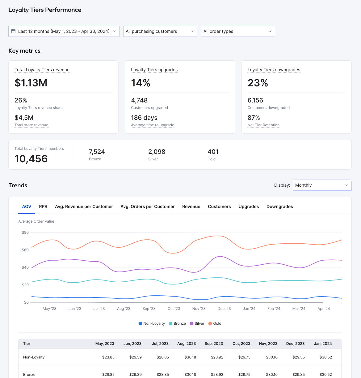
Loyalty Tier Members
This section shows the number of customers in each loyalty tier as of the last day of the selected date range. The data reflects all-time membership up to that point and updates based on the timeframe you select.
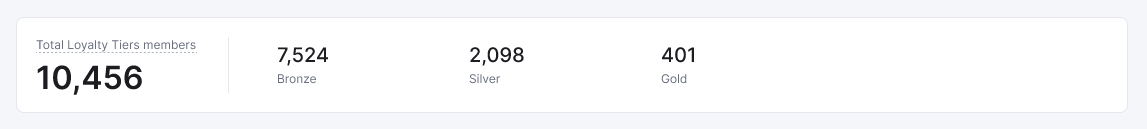
Tier Performance Over Time: Trends
Use the line chart to track changes and trends in your Loyalty Tiers program over time. Depending on your selected date range, you can view data by week, month, quarter, or year. You can also drill down into specific segments using the dashboard filters.
Tip
You can click on tier names in the chart legend to add or remove them from the view for better comparison.
Available Metrics
Average Order Value (AOV): Total revenue divided by total orders. It shows the average spend per order.
Repeat Purchase Rate (RPR): Percentage of customers who placed more than one order during the selected period.
Avg. Revenue per Customer: Total revenue divided by the number of customers. It helps measure individual contribution.
Avg. Number of Orders: Total number of orders divided by the number of customers. It indicates average purchase frequency.
Revenue: Total order value generated by the selected customer group.
Customers: Total number of unique customers in your selected segment.
Upgrades: Number of customers who either joined the loyalty program or advanced from a lower tier.
Downgrades: Number of customers who moved into the tier after being downgraded from a higher tier.
Difference between Key Metrics and Upgrades/Downgrades data
The Upgrades and Downgrades metrics in this chart will differ from those in the Key Metrics section. That’s because this chart shows data broken down by time intervals (e.g., monthly), which may include multiple events per customer. In contrast, the Key Metrics section only counts the customer’s final status change within the selected period.
Example
Custom date range: January – March
Customer A upgraded in January
Downgraded in February
Downgraded again in March
Key Metrics:
Downgrade count = 1 (the final status change for Customer A during the selected period)
Trend Chart:
January = 1 upgrade
February = 1 downgrade
March = 1 downgrade
Important
The Non-Loyalty trend line will not appear if your opt-in strategy is set to All Customers and you’re using Shopify’s new Customer Accounts. However, if you switched from Legacy to Customer Accounts, you will still see a Non-Loyalty trend line representing customers who joined before you made the switch.
Tier Performance Over Time: Table
.gif)
Below the trends chart, the same data is shown in a structured table. This makes it easy to compare metrics across tiers and time periods. The table dynamically updates based on the filters and time range selected above.
Was this article helpful?