Product Gallery
- DarkLight
Product Gallery
- DarkLight
Article summary
Did you find this summary helpful?
Thank you for your feedback
Goals and Outcomes
The Product Gallery is a customizable photo gallery that showcases curated photos of real shoppers enjoying your products, right on your product pages! By featuring authentic customer content, you help shoppers connect with your brand on a personal level, see your products in action, and make more confident purchasing decisions.
In this article, you'll learn how to create and publish a product gallery.
Getting Started
To get started, we recommend curating customer photos from the Photos Curation section into custom photo albums.
Tip
We recommend creating product albums and naming them according to their location on your site. For example, Aviator Sunglasses, Leather Strap Diving Watch, etc.
Important
Media tagged to products in reviews are not automatically added to product galleries. While Yotpo identifies which product is associated with the photo, the image will not be added to the corresponding product album by default. This gives your brand full control to moderate and decide what visual content is published.
To include the image in a gallery, you must manually add it via the Add to album option in the Photos Curation section.
Additionally, product galleries are created or updated only when products are explicitly selected in the album, not just tagged in media.
Creating a Product Gallery
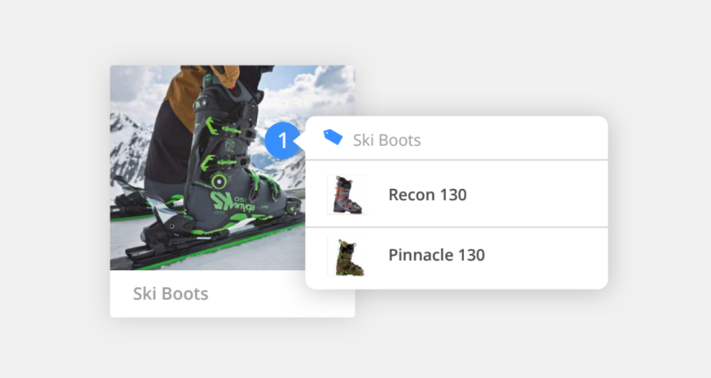
Creating a new Product Gallery is as easy as tagging products in your curated photos!
To create a new gallery:
Log into Yotpo Visual UGC.
Click Galleries > Photo Galleries.
Click Create New Gallery.
Name your gallery and select Product Gallery from the dropdown menu.
Tip
We recommend naming your gallery based on its intended location on your site.
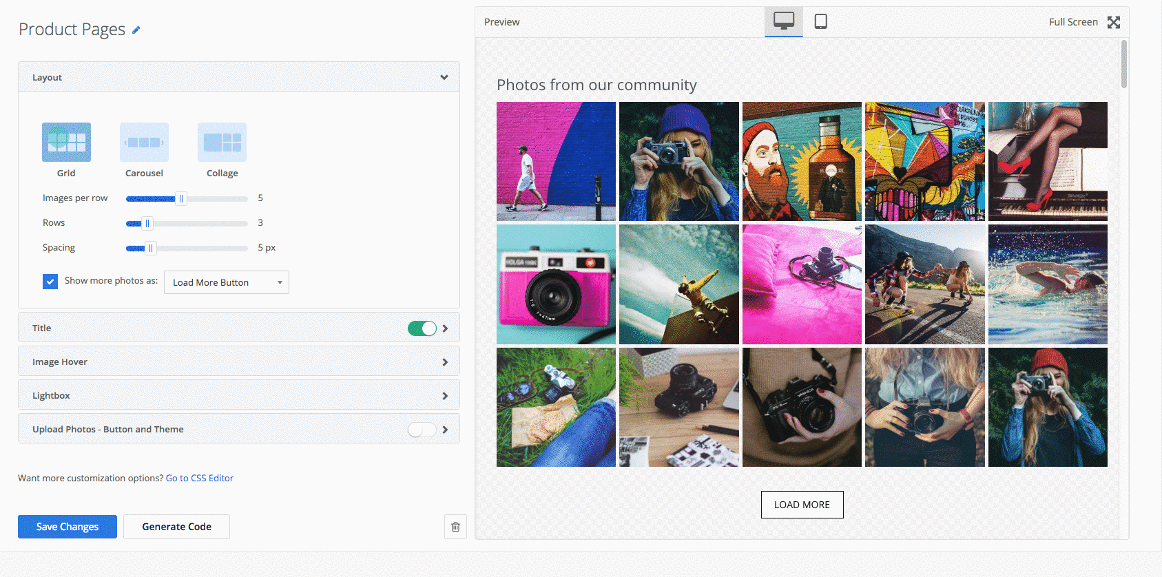
Customize your gallery settings and design to match your site's look and feel.
Click Save Changes.
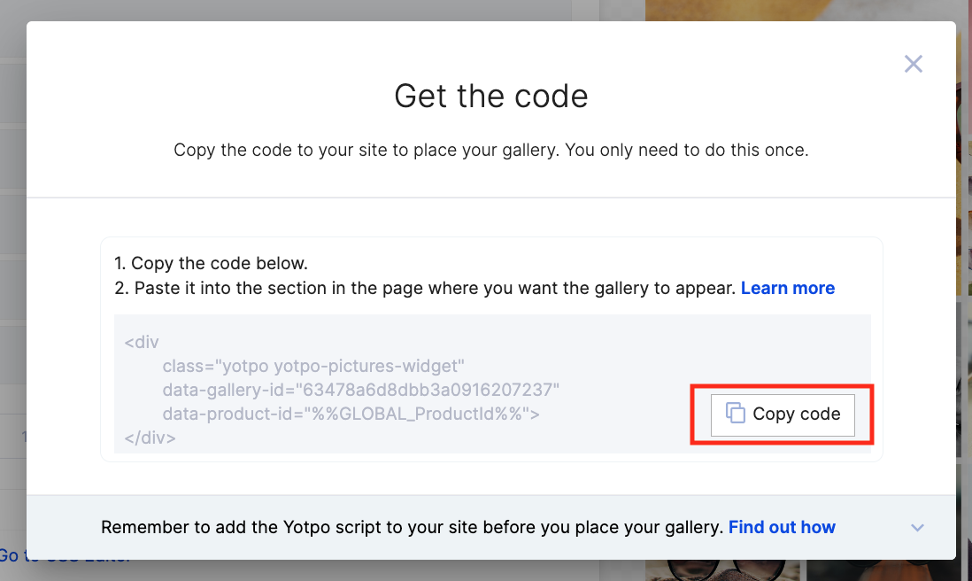
When you're ready to add the gallery to your site, click Place Gallery.
Click Copy Code and paste the gallery code within the desired <div </div> on your store's product page template.
What Happens Next?
Once the gallery code is embedded on your product page, user-generated photos tagged with a product will automatically populate the Product Gallery on the relevant product page according to the data-product-id="{{ product.id }} attribute.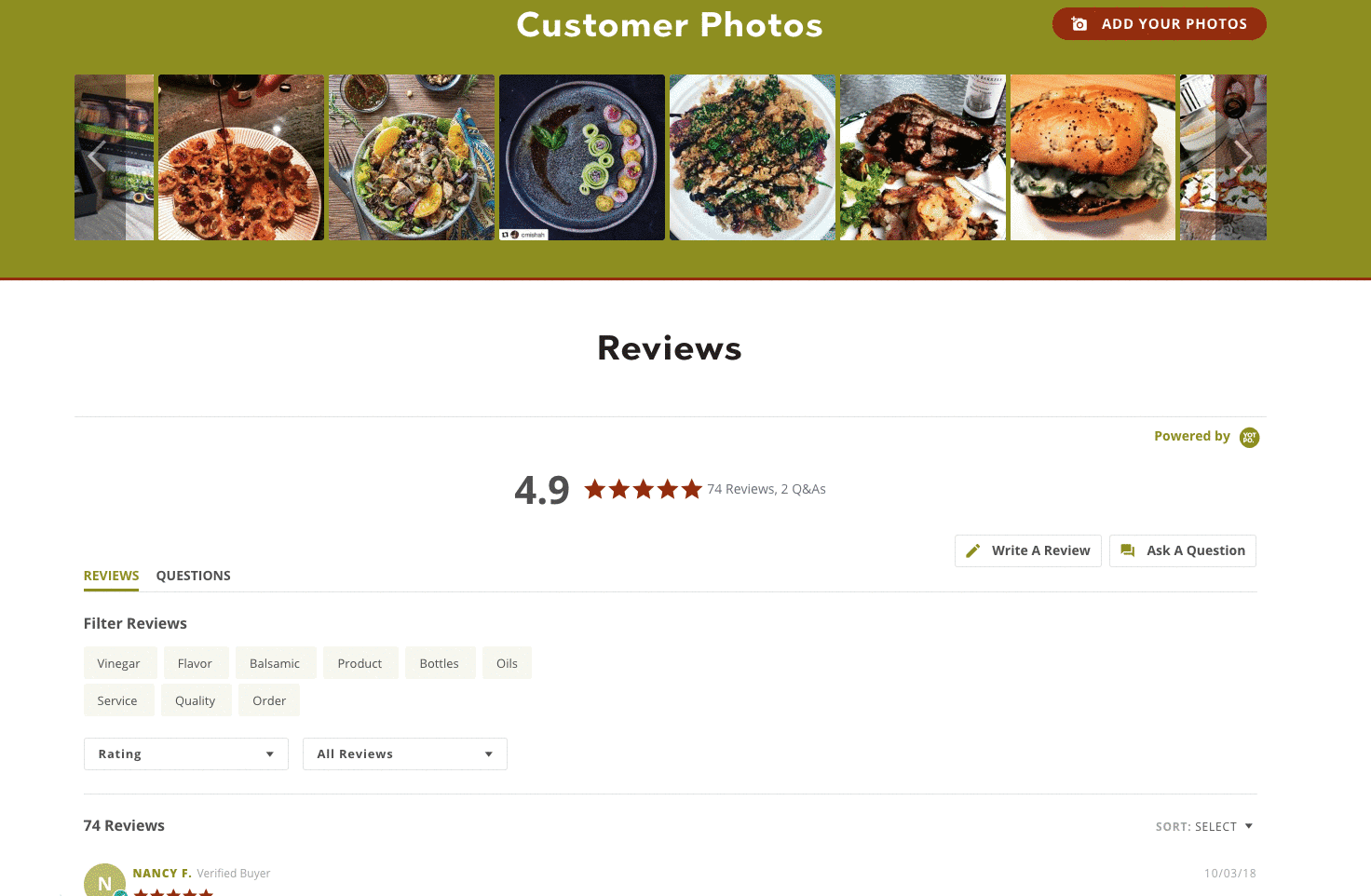
Important
A Product Gallery will only appear on a product page if there are at least 3 published photos tagged to the gallery for that product.
Gallery Image Sorting
By default, images are sorted and displayed based on the date they were added to the album (newest first), alternating by source (e.g., Instagram, Reviews, On-Site Upload) in chronological order.
Tip
If you prefer to display photos according to their last moderated date instead, please reach out to your Yotpo account representative for assistance.
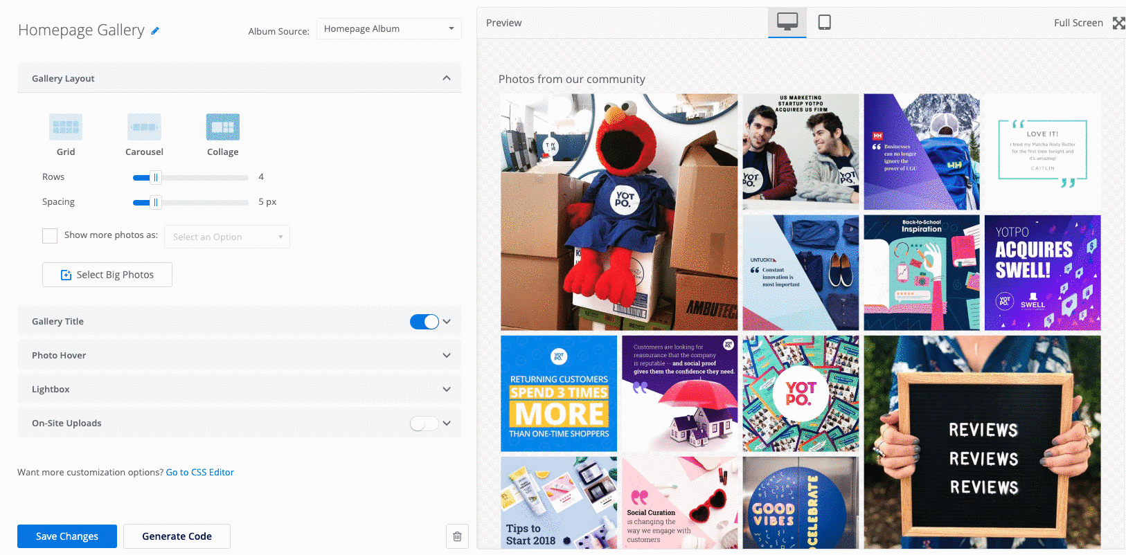
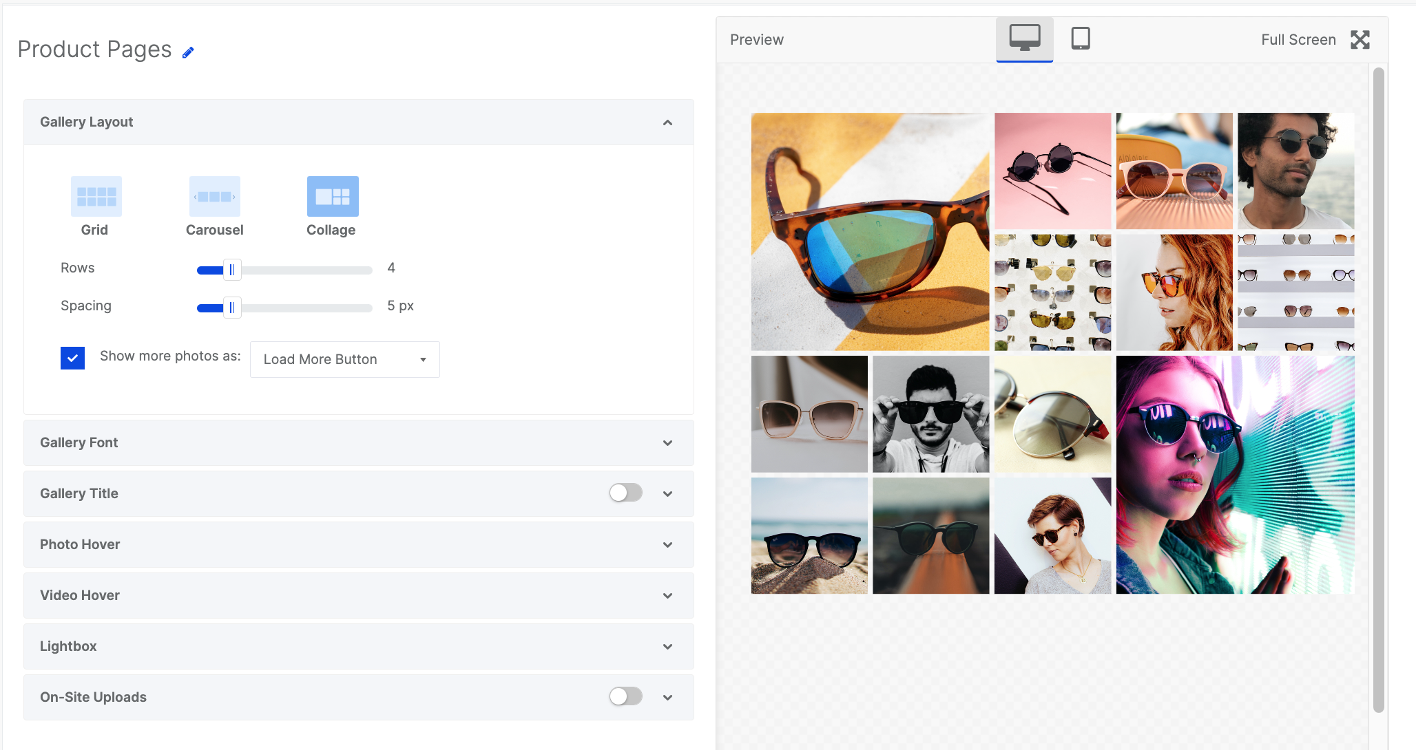
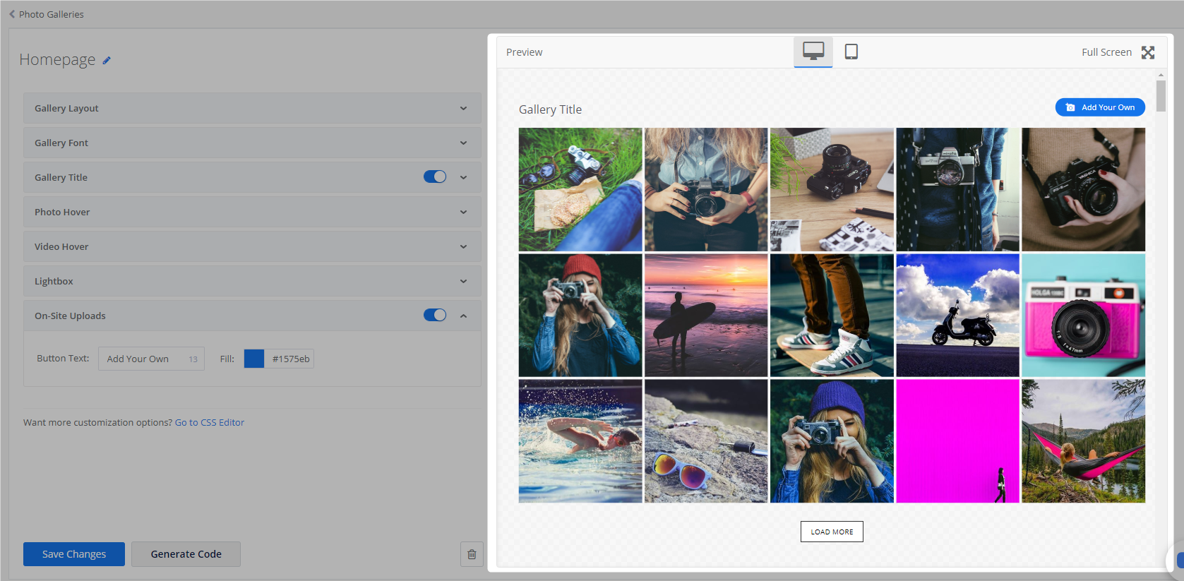
Gallery Design and Settings
Customize your product galleries to align with your brand’s style using our built-in design settings.
Gallery Layouts
Choose a layout based on where the gallery will appear on your site.
Grid Layout
Select Grid to create a full-page Product Gallery. As your photos will fill the entire page, we recommend creating a dedicated page on your site to host this gallery.
Set the desired number of rows, photos per row, and border spacing.
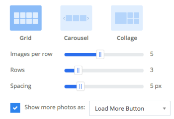
Choose one of two scroll styles for your Product Gallery widget by checking the Show more photos as box.
Endless Scroll: Will automatically display more photos once your shoppers scroll to the bottom of the page.
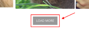
Load More: Shoppers who reach the bottom of the page will be prompted to click a Load More button in order to load additional photos.
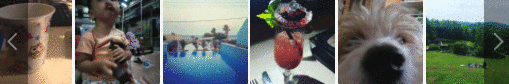
Carousel Layout
The carousel layout is a great way to fit many photos in a small area on your site. Photos are displayed in a single strip of photos and can be cycled using the left/right arrows or set to Auto Slide.
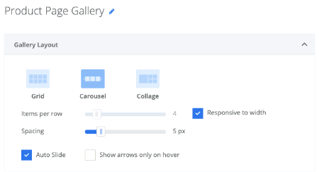
Use the Items per row slider to control the amount of photos and/or videos displayed in your carousel or simply check the Responsive to width option to display the maximum amount of items that will fit in the carousel based on the component (<div>) width on your site.
Check Auto Slide to enable the auto slide feature.
Your gallery will automatically cycle through photos in an eye-catching layout and can still be manually cycled using the left and right arrows.
The Carousel layout supports a maximum of 56 photos.
Collage Layout
Transform your galleries with Yotpo's new and engaging Collage layout!
Choose the number of rows and set the desired spacing between photos.
**Please Note: The Collage Layout can change in accordance with the size of the element it is implemented in. For more details, click here.
Gallery Title
Add a title to your Product Gallery to provide context for your user-generated product photos.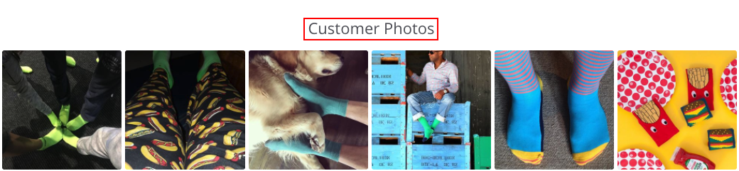
For Example:
"See our products in action!"
"Photos from our customers"
"Add #hashtag to your photos to have them featured here!"
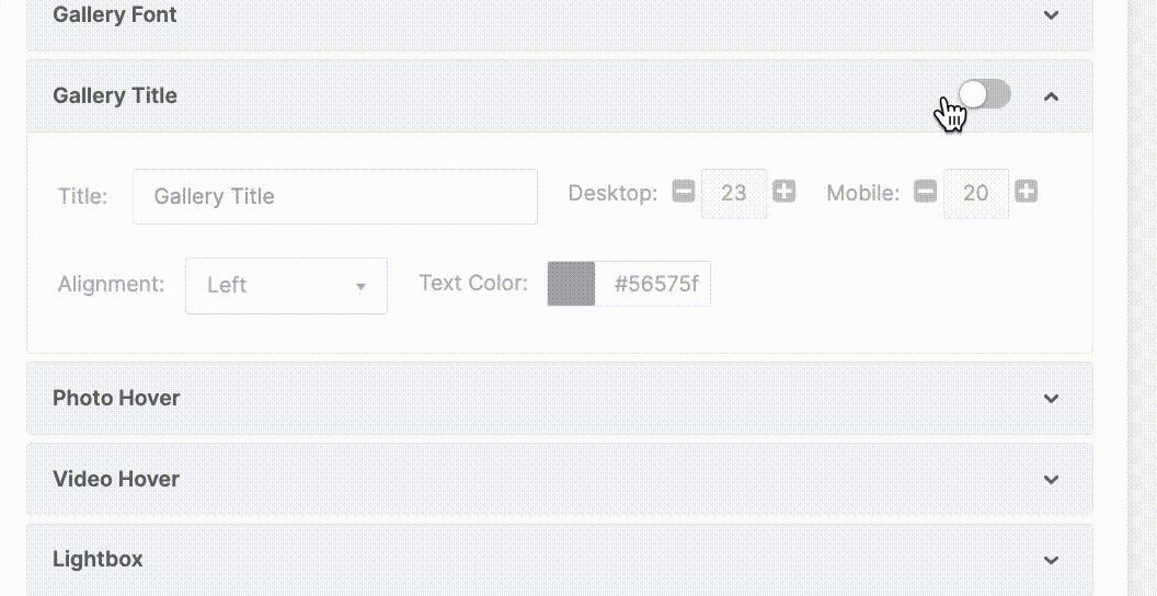
Title customization
To display a gallery title:
Enable the Title toggle button so that it appears green.
Include your gallery title in the text box below.
You can also customize the gallery title color (HEX), alignment, and font size for desktop and mobile views.
Tip
Including a branded hashtag can help you generate more visual content.
For example, you can launch a contest or marketing campaign to collect photos from your customers and have the best photos featured in your Product Gallery!
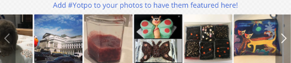
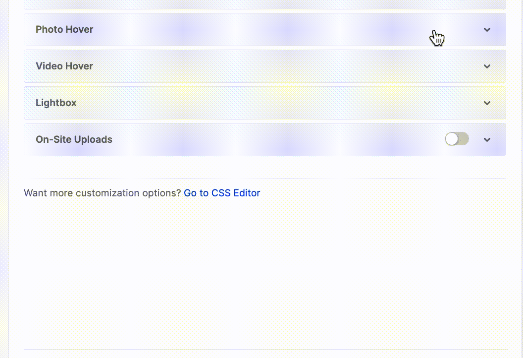
Photo Hover
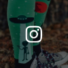
Give your gallery photos some added depth with hover-over images and effects. Photo hover overlays can also indicate the source of the photo in the gallery (e.g. Instagram or Reviews).
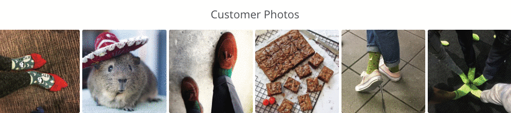
Photo Hover Customization
You can customise the background color (HEX) and opacity of the hover overlay using the relevant Background and Opacity settings.
Click on Display Icons to include the photo source icon.
For example, photos sourced from Instagram will display an Instagram icon while photos sourced from reviews will display a five-star review icon.

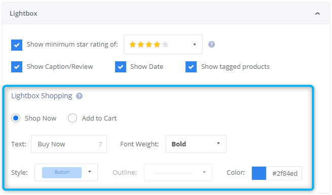
Lightbox
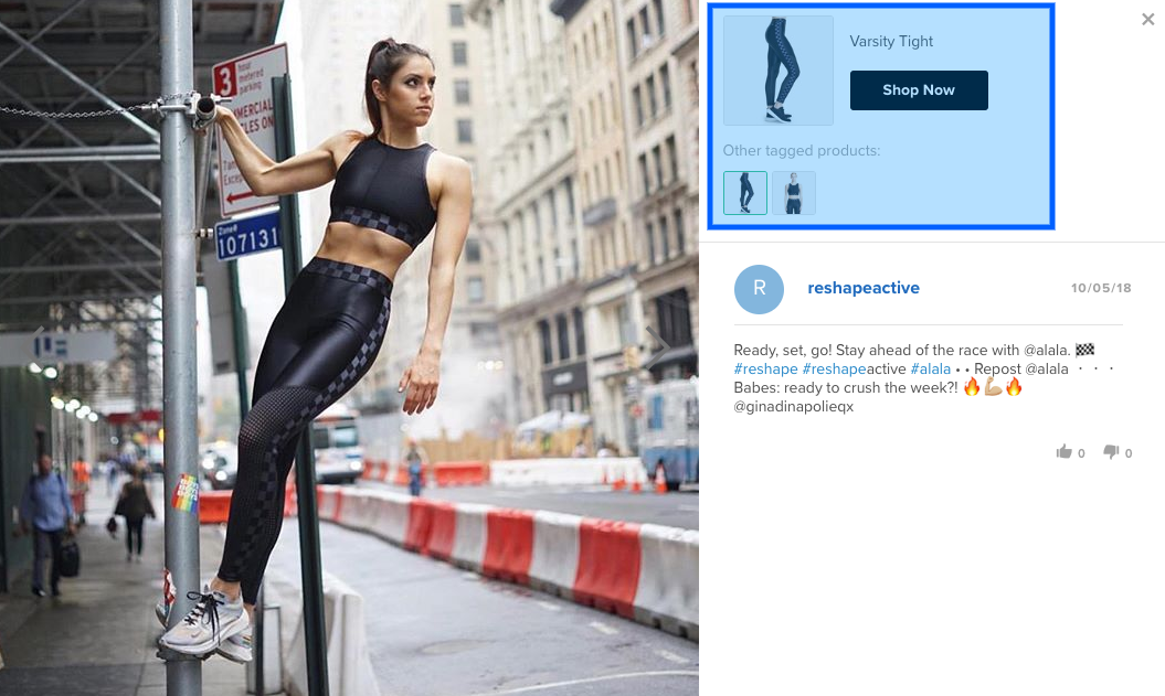
Clicking a photo opens it in a full-screen lightbox for an immersive viewing experience. Customize the button text and color to match your brand’s look and feel.
Lightbox Button Customization
You can customize the text and color of the call-to-action button within the lightbox to match your site's voice and color scheme.
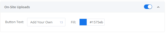
On-Site Photo Uploads
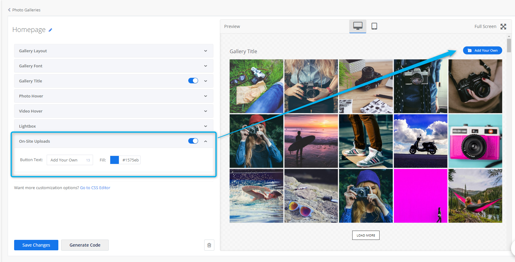
Let shoppers upload photos directly to your gallery by adding a photo-upload button. Uploaded photos will appear in the Uploaded tab of the Visual Curation section, where you can review and curate them into photo albums.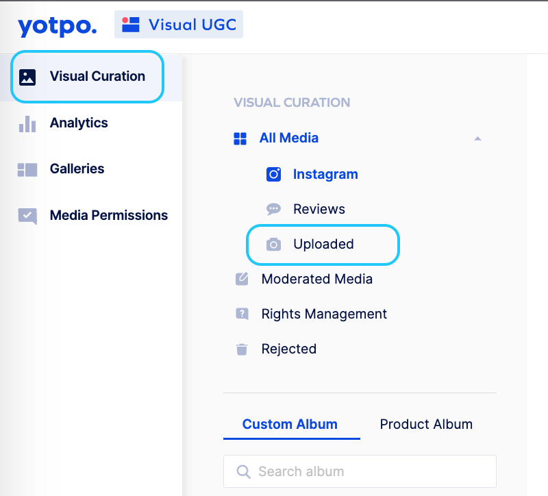
Look & Feel Customization
You may customize the photo upload button text, font, size, and color.
Widget Interaction
Shoppers who upload photos through the Product Gallery on your site will be prompted with the popup below. Shoppers may add a caption to each photo and must provide their name and email address in order to complete the photo upload flow. 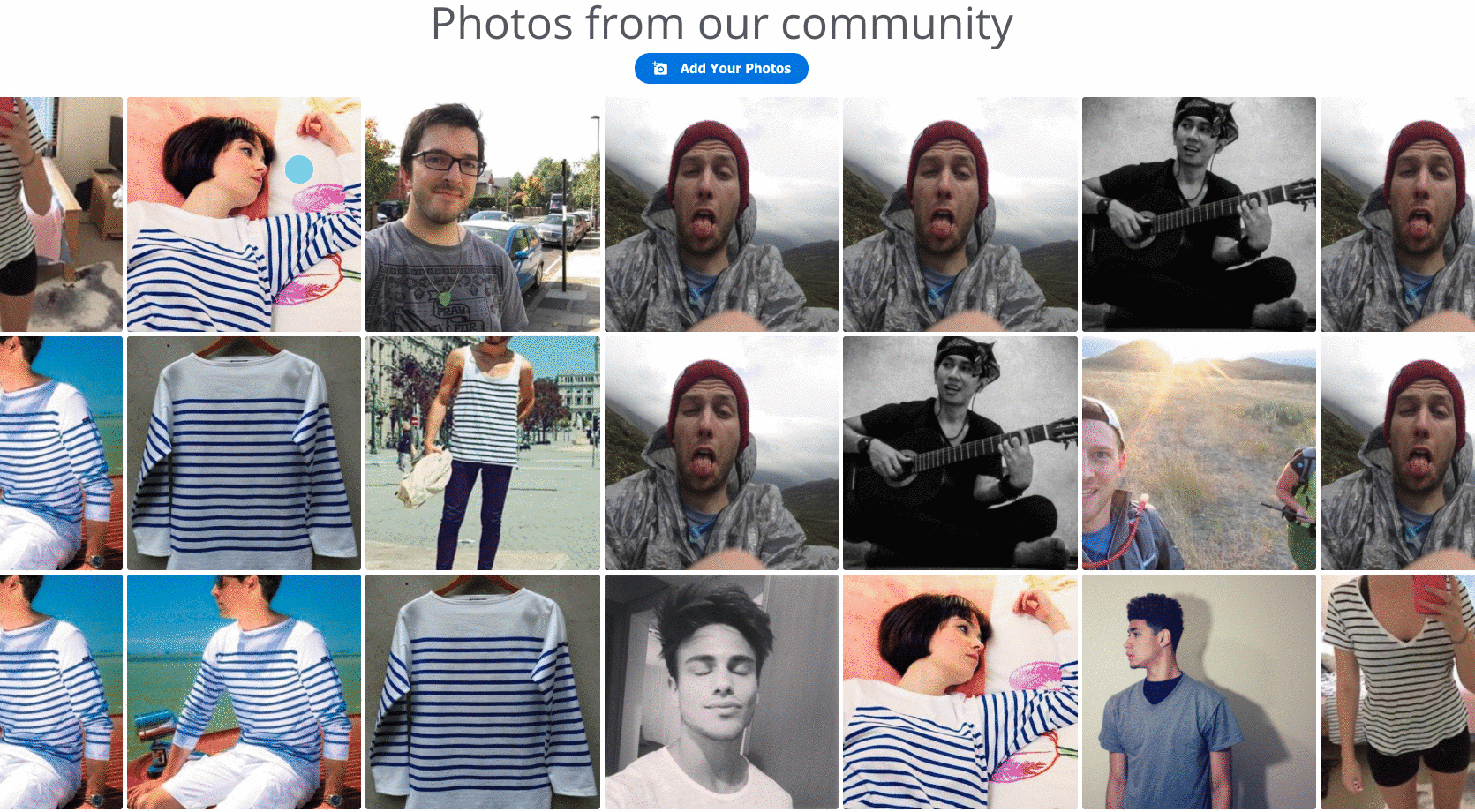
Photo Requirements
Photo upload guidelines:
Shoppers may upload up to 3 photos at a time.
Shoppers must provide their name and email address.
Photos must be in JPG, PNG, or GIF format.
Each photo must be under 15 MB in size.
Photos must be larger than 400x400 pixels.
Preview Pane
The Preview Pane on the right side of the screen will show you how your gallery will appear on your site based on your settings.
Tip
Click Full Screen for a full-screen preview of your gallery widget.
Use the desktop/mobile icons to toggle between views.
Generating a Product Gallery Code
Click Generate Code to generate your gallery code. This code contains your gallery settings and the customizations you’ve configured.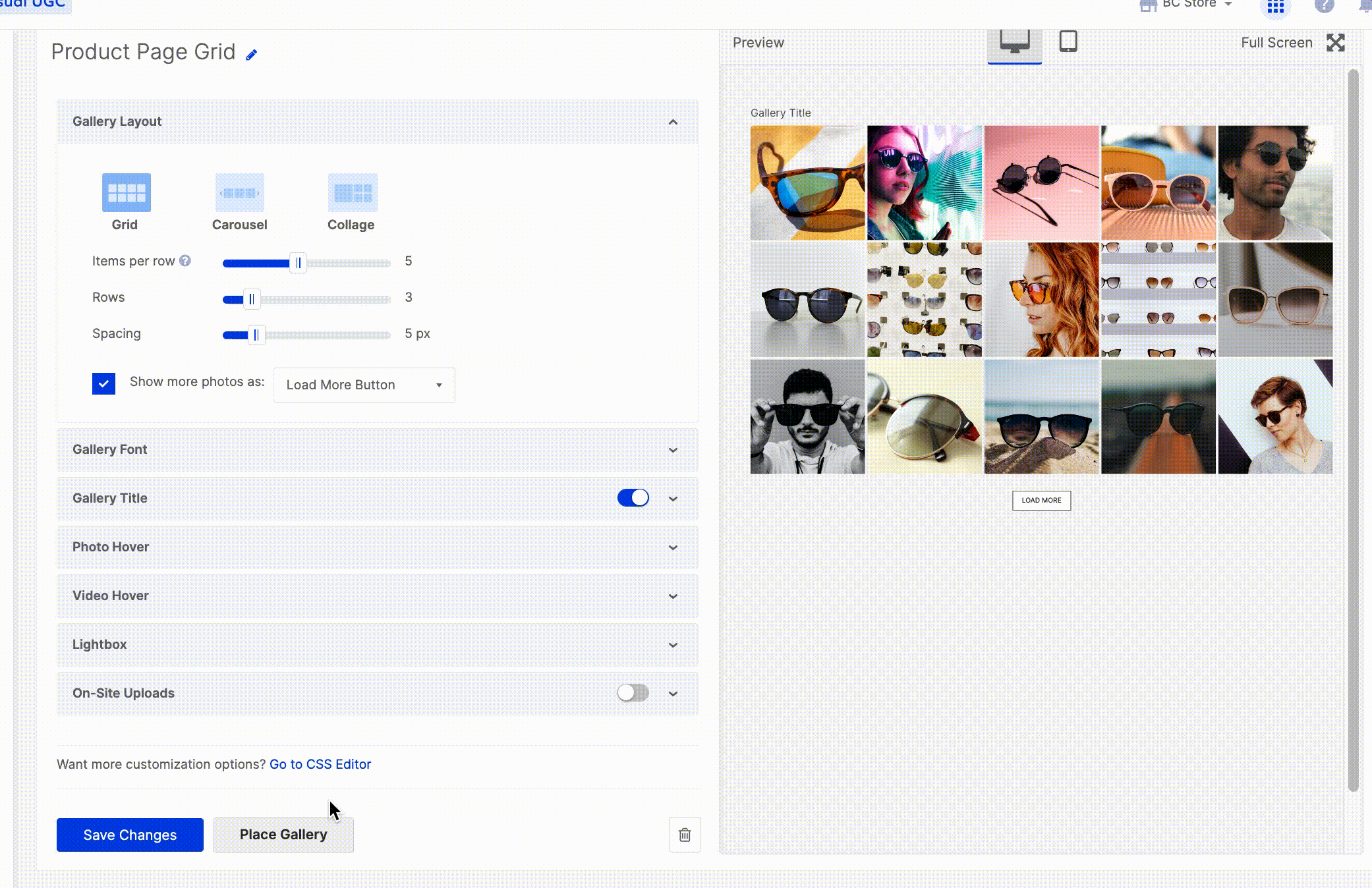
Note
At least 3 photos must be published in the Product Gallery for each product in order for it to appear on product pages.
Adding the Product Gallery Code to Your Site
To display the Product Gallery on your product pages, paste the gallery code snippet into the desired <div> within your product page template.
The snippet includes the data-product-id="{{ product.id }}" parameter, which automatically pulls in the correct product images for each page, no manual tagging or ID entry required.
Once implemented, the gallery dynamically associates the appropriate product with the widget using the {{ product.id }} value from your store’s data.
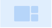
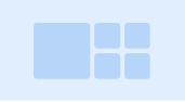
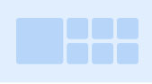
Collage Layout Behavior by Element Size
The Mosaic Gallery layout automatically adjusts based on the size of the container it's placed in:
If the element size is 0-415 px, the gallery will show one large image and two small ones:
If the element size is 415-1280 px, the gallery will show one large image and four small ones:
If the element size is 1280 px and above, the gallery will show one large image and six small ones:
Was this article helpful?