VIP Tiers On-site Module
- DarkLight
VIP Tiers On-site Module
- DarkLight
Article summary
Did you find this summary helpful?
Thank you for your feedback
The VIP Tiers Module is a highly customizable way to display all your VIP tiers onsite. You can deploy a new module in minutes, with no development required.
In this article find out how to access, customize, and deploy the VIP Tiers Module on your site.
Before you start
Before you begin setting up your VIP Tier On-site Module or Section, you need to finish setting up your VIP Tier program configuration.
Accessing the editor
Accessing via the Rewards Page Builder
To create a new VIP Tiers section via the Rewards Page Builder, do the following:
In your Yotpo Loyalty & Referrals main menu, go to Display On-site > Rewards Page Builder.
Click Create Rewards Page or click the existing page you want to edit.
Click VIP Tiers Section.
Proceed below to the next step, "Customize settings"
Accessing as a module
In your Yotpo Loyalty & Referrals main menu, go to Display On-site > VIP Tiers Module.
Click Edit on the instance you wish to edit or click "+ Create new"
Please note:
Your module won't appear on your site until you publish it.
Customizing the module
Tip:
In the Module editor, you can customize how your Module appears onsite, but not how the VIP tiers themselves behave. If you need to manage your VIP tier program, click "VIP Tier Settings."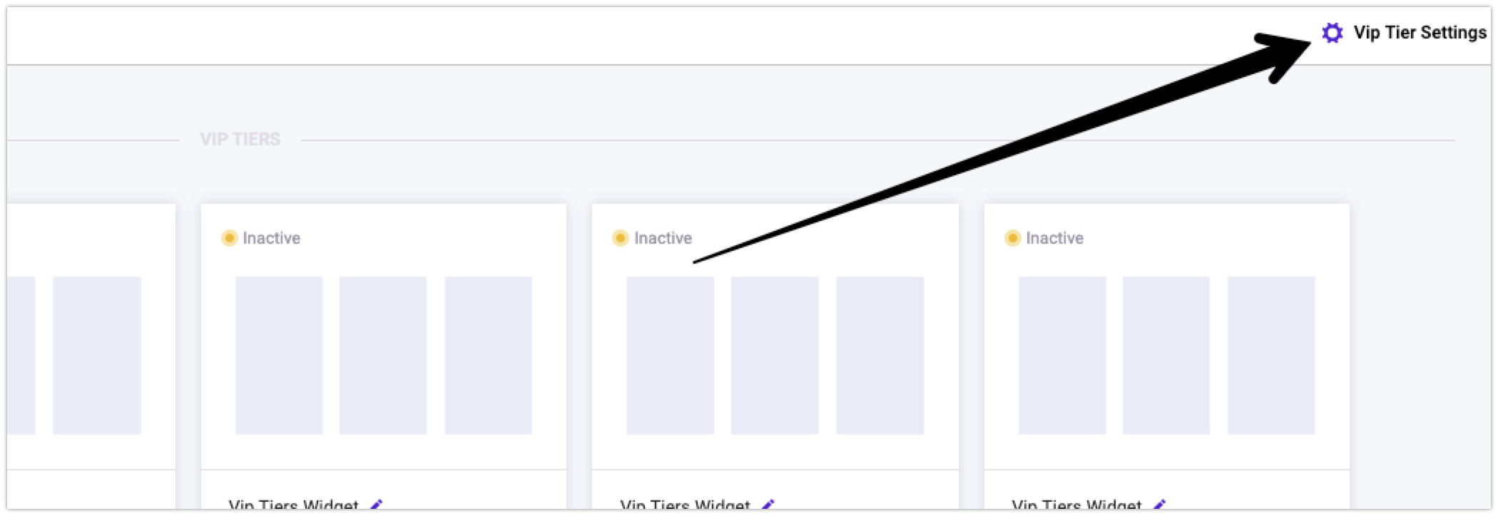
The first thing you'll be asked to do is select which VIP tiers you want to include in your module, and you'll have the option to add a base tier if you wish. There are four sections in the module editor:
Layout
General appearance
Customize tiers
Current tier appearance
Layout
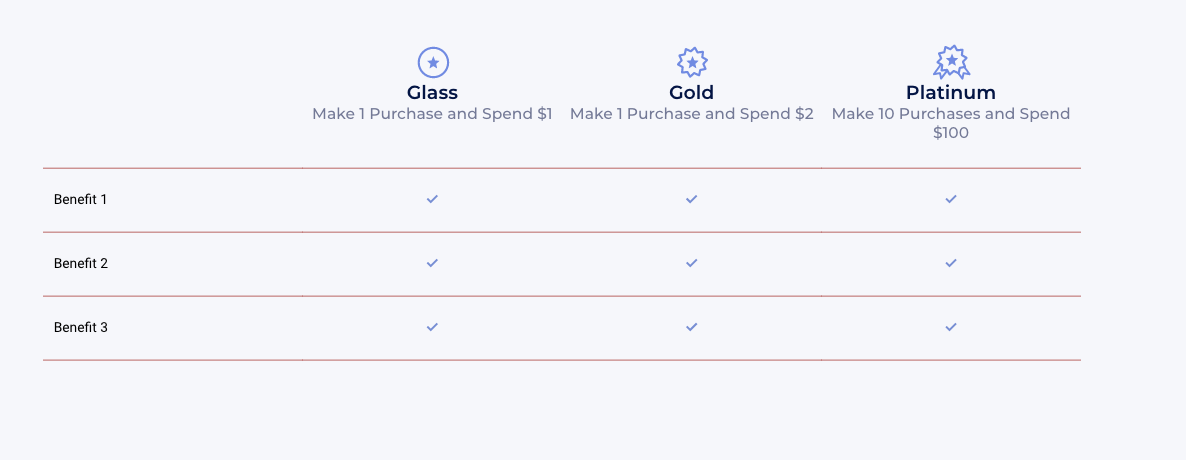
This section lets you choose the layout for the VIP tiers module. There are two layout options, "Tile" and "Grid" layout.
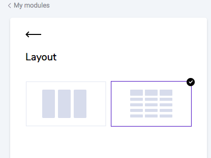
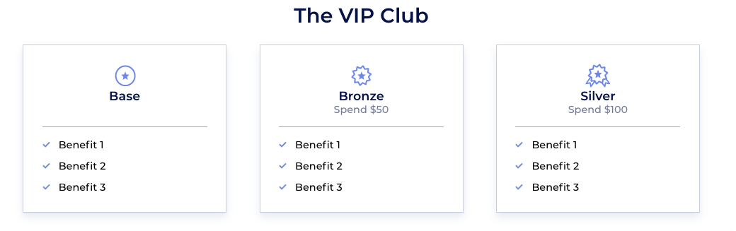
Tile Layout
Below is the default appearance of the tile layout:
Define the spacing between the different tiles. Choose Big, Small, or No spacing.
Grid Layout
Below is the default appearance of the grid layout
General appearance
Background color
Choose whether you want to add a background color or have the widget be transparent.
Fonts
Primary font
The font you choose here will be applied in several places around your module.Secondary font
The font you choose here will be applied in several places around your module.
Module Header
Header font size
Header color
Tile Layout Settings
Drop Shadow Choose if you would like to add a drop shadow to your tiles.
Background color Change the background color of the tiles.
Border color
Change the border color of the tiles.
Divider options
Customize your icons and the line that divides the top and bottom halves of the tile.
Divider color
Choose the color of the line that divides the top and bottom half of the tile.
Grid Layout Settings
Table Design
Lines color
Choose the color of the lines on your table.
Benefits Design
You can change the font size & color of the benefits, as well as the icon type and color.
Mobile Text
If there are too many benefits to display on a mobile device, a button will display to show more/show less. Customize the text on these buttons.
Advanced
CSS editor If you'd like to make further customizations to the module, use our embedded CSS editor. If need to make any overriding changes to the VIP Tiers Module CSS, use this class name before the class you want to override:
.yotpo-widget-VIP-tiers-widget.yotpo-widget-override-css {
}
If you are using the CSS Editor, you may see a notification asking you to update your Module version from time to time. Read more about Module Versions.
Please note:
Please make sure to use our embedded CSS editor instead of hardcoding directly onto your storefront.
We will not update a specific module instance if we detect that it will impact your live module version. Our team can only detect these issues if the CSS is in our editor.
Customize tiers
Choose a tier to customize You can individually edit each one of your predefined tiers, and add a base tier if you didn't add one in the first screen.
Text
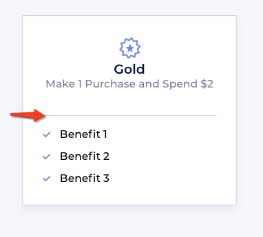
Tier title text
Tier subtitle text- The system will auto-populate the variables associated with the VIP tiers you set up in your admin. For example, if you have spend-based tiers, the system will automatically pull in the value you set in your VIP tier setup. These are the possible variables:
{{amount_spent}}
This is the spend requirement to enter the tier (as defined in your VIP tier settings
{{referrals_completed}}
This is the number of referrals required to enter the tier (as defined in your VIP tier settings){{points_earned}}
This is the number of points required to enter the tier (as defined in your VIP tier settings){{purchases_made}}
This is the number of purchases required to make to enter the (as defined in your VIP tier settings)
Design
Select a step to customize You can individually edit each one of your predefined tiers.
Clicking Apply design to all tiers will take the following design settings and apply them across all the tiers. This is a quick and easy way to apply changes to your tier design.
Icon color & opacity
Title font size & color
Subtitle font size & color
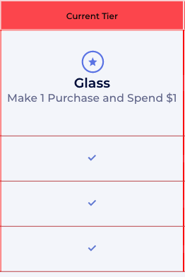
Current tier appearance
Show your customers which tier they are currently in by customizing the "current tier" design and colors.
Tier Status
Example of Current Tier on Grid Layout
Current tier banner
Customize the banner
Current tier colors
Make the customer's current tier look unique from the others
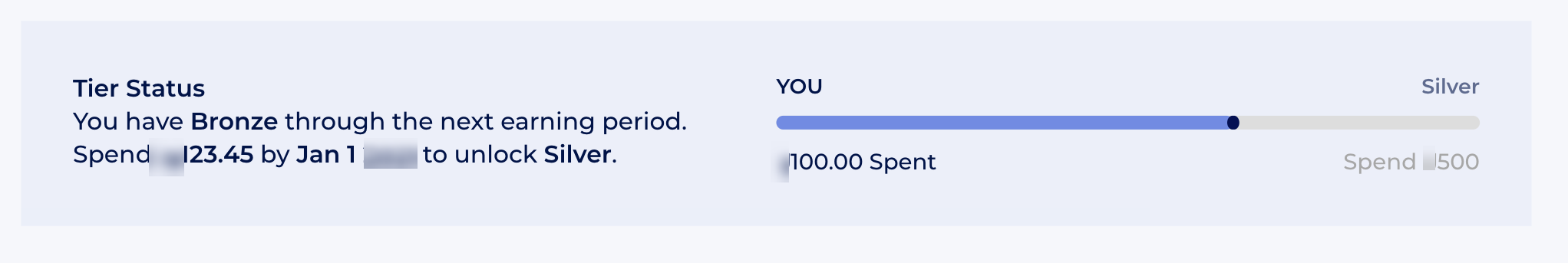
Progress bar
Please note:
The progress bar can not support "secret" tiers (i.e. an extra exclusive tier that exists but is not displayed on your site.) If you have a 'secret' tier, then we don't recommend enabling the progress bar on your Module.
Choose if you want to display a progress bar that will display to the customer exactly what they need to do to reach the next tier.
Customer reference
This is the word or phrase you want to use to indicate to the customer that they're looking at their own progress.
Customer status
Use this to display their current progress. The system will auto-populate the variables associated with the VIP tiers you set up in your admin. For example, if you have spend-based tiers, the system will automatically pull in the value you set in your VIP tier setup.
These are the possible variables:
{{amount_spent}} This is how much they've spent in the current tier term (tier term refers to the length of time a customer will keep their VIP Tier status once found eligible
{{referrals_completed}} This is the number of referrals they've made in the current tier term
{{points_earned}} This is the number of points they've earned in the current tier term
{{purchases_made}} This is the number of purchases they've made in the current tier term.
Current tier
Let the customer know what tier they are currently in with the variable:
{{current_vip_tier_name}}
Next tier
For the first 9 months after the customer earns their tier, they'll be shown what they need to do in order to level up to the next tier.
These are the variables that you can use in this field:
{{spend_needed}} or {{points_needed}} or {{referrals_needed}} or {{purchases_needed}} (depending on what your VIP tier entry requirements are)
{{tier_expiration_date}}
{{next_vip_tier_name}}
Maintain tier
If they are within 3 months of their tier expiring, they'll be shown what they need to do in order to maintain the tier they're in.
These are the variables that you can use in this field:
{{spend_needed}} or {{points_needed}} or {{referrals_needed}} or {{purchases_needed}} (depending on what your VIP tier entry requirements are)
{{tier_expiration_date}}
{{current_vip_tier_name}}
Publishing the VIP Tiers module
For your module to appear onsite, you need to embed some code onto your site. See a guide for Embedding Modules on Shopify.
Publishing via the Rewards Page Builder
If you are building your VIP Tiers Section with the Rewards Page Builder, follow the steps for publishing your Rewards page.
Activate instance
Active
If your module is active (green dot), this means that any changes you publish will be reflected on your store if the module snippet is embedded.
Inactive
If your module is inactive (yellow dot), this means that any changes you publish/save will not be reflected on your store. This also means if you had the module snippet embedded and active on your store before, it will not be visible when inactive.You're all set!
Was this article helpful?